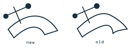
While not a new logo per se, we’re proud to announce a cleaner, smoother version of our logo.
The old version was drawn in one quick motion and was meant to be a playful representation of the company. It’s served us well for the last 4 years, but we decided it was time to clean it up a little. We’ve smoothed out the curves, and tucked in the points:

old vs new